BOOK STRUCTURE AND COLOUR PALETTE
Charles Dickens released the story in weekly installments in his magazine All the Year Round in 1859. The story has been written in a series of 3 books to create a sense of jump in timelines for the reader and exaggerate the contrast of the two cities.
Taking inspiration from the names of the section, the section colours were determined as red, golden and grey. The entire book follows that same consistency of colour.



CONCEPT
The novel has been written in a theatric nature with dramatic descriptions, emotional scenes, moral speeches, clear heroes and villians. Many adaptations of the novel in theatre plays, movies and tv dramas have depicted the story through the genres of romance, noble tragedy, realism, historical, gritty and violent.
What would a modern take on the romantic, dramatic, theatric and emotional essence of the tale look like? What would the reading experience be like?

MOODBOARD
STORY LINE
Charles Dickens’ A TALE OF TWO CITIES is a historical novel set in London and Paris before and during the violent French Revolution. Charles Dickens’ classic novel contrasts the struggles of the oppressed poor with the cruelty of the aristocracy. The story’s major themes are of sacrifice, resurrection, duality and social upheaval. This novel is considered to be darker than most of Charles Dicken’s work. The novel follows Dr. Alexander Manette, his daughter Lucie, Charles Darnay, Sidney Carton and the Defarges as the leading characters of the story.


A Tale Of Two Cities
~ Charles Dickens ~
Illustrated by
~ Kashvi Shah ~
BOOK/PAGE SIZES
A square book is more playful in comparision to traditional rectangular book sizes.
The square book does not achieve a dramatic effect but it gives a soft, luxuruious and intentional feel to the overall reading experience.
A rectangular book size created drama, luxurious feel and a soft aesthetic to the book as it feels intentional.
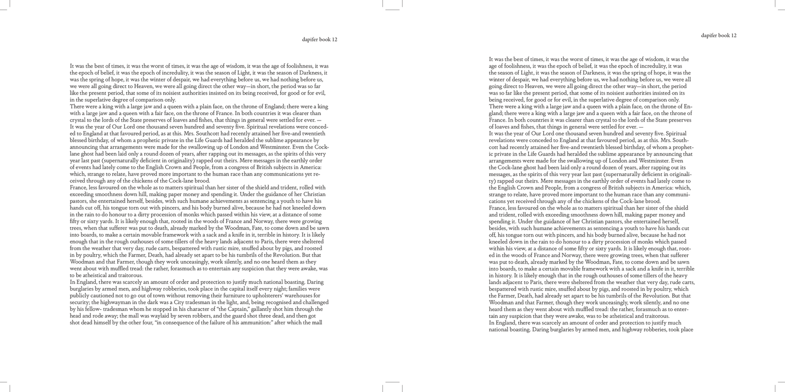
The two column layout created dynamism on a large rectangle page which would provide breathing space for the eyes of the reader browsing the page.
The dimensions of the first book size iteration was 34cm x 27cm. With respect to the margins, column size, column spacing, there was a lot of empty white space that made the page look empty and incomplete.
I decided to determine the most optimum sizing by cutting the edges and analysing white spaces, margin space, and overall shape of the book. The final dimensions that was the correct fit was 30cm x 25cm.
Book and page sizes were decided by understanding the main aesthetic I wanted to achieve with the book and then looking at other published classical, children, coffee table, novels, and many other books to gauge and experiment with book sizing.
I used newspaper to mimic and roughly achieve foundational book sizes from books that were similar to the size that seemed most appropriate and experimental.


LET'S TALK ABOUT WINE
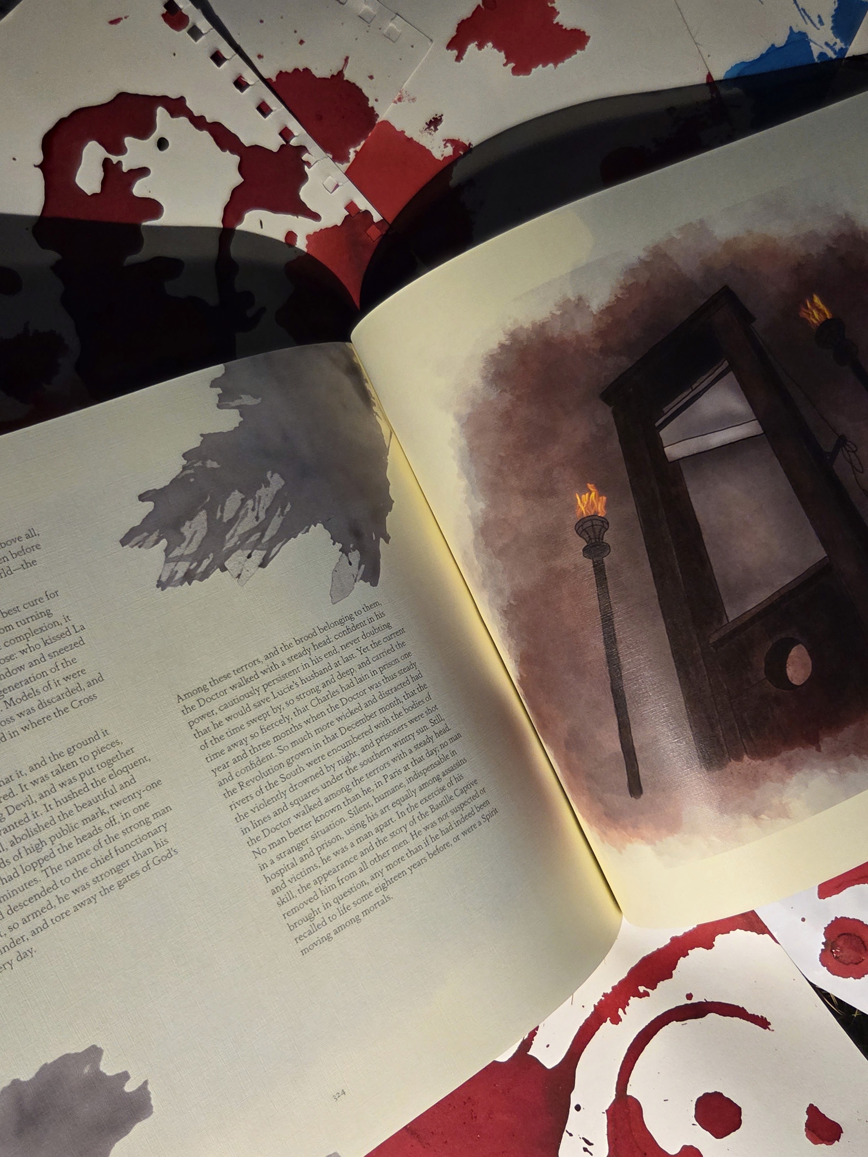
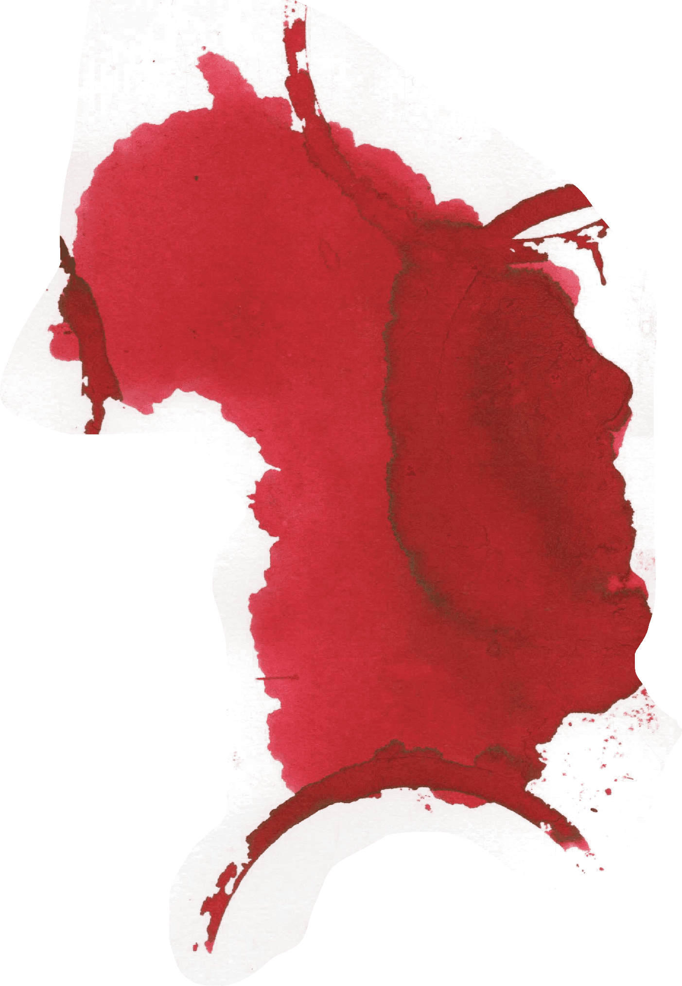
A large wine spill is used as a very important element for oreshadowing bloodshed in the story. Inspired from this I created multiple graphic images that would run along the entirety of the book with dynamic placement on each page which makes for an entirely new reading experience.
These are spills formed by physically spilling various liquids like tea, coffee, inks and paint to create realistic and organic spills. These spills were later refined through photo manipulation.


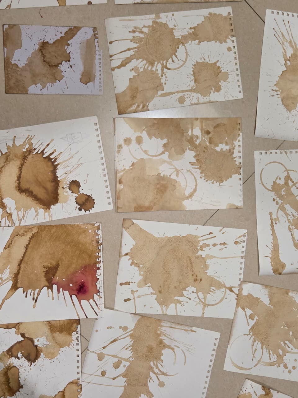
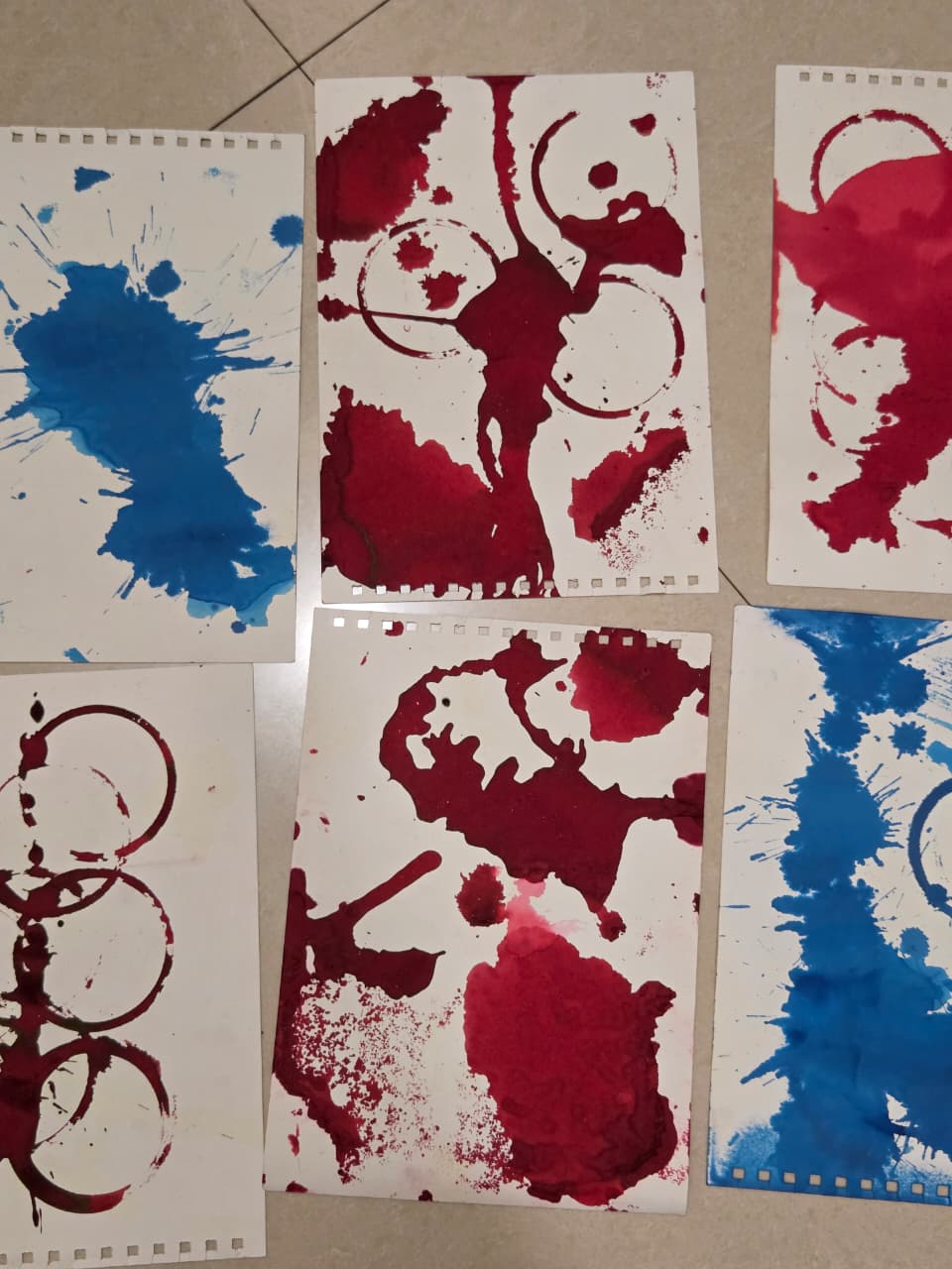
GALLERY OF SPILLS AND SPLASHES
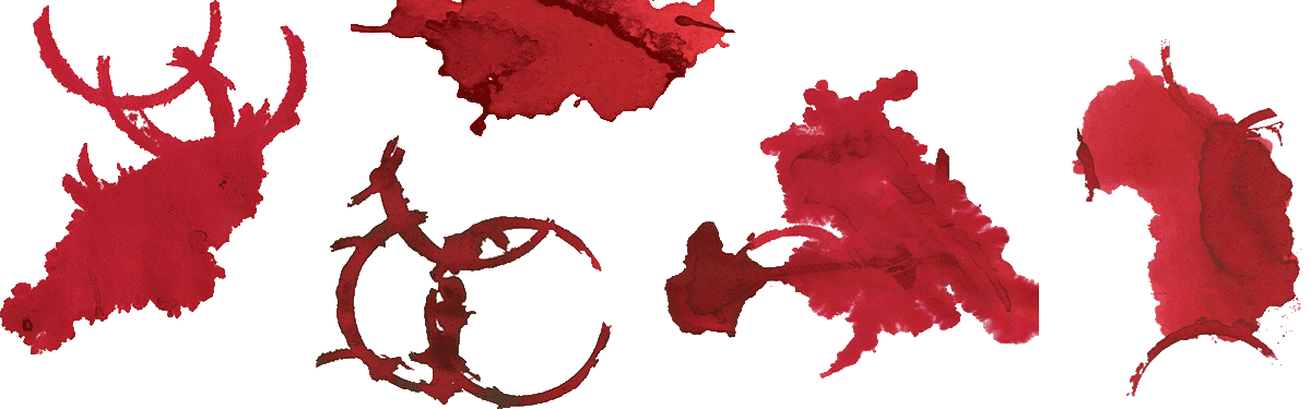


LAYOUT

I decided to create a dynamic layout for each page where the splashes are on every page and mixed with the text and story layout. The columnal layout along with the splashes allowed for a more playful approach to the layout. Instantly there were more options, each page would have a slightly different layout.
This layout would lead to a more active reading experience where each page turned would encourage the reader to scan the whole spread and engage with the story and the other illustration elements.
ILLUSTRATIONS
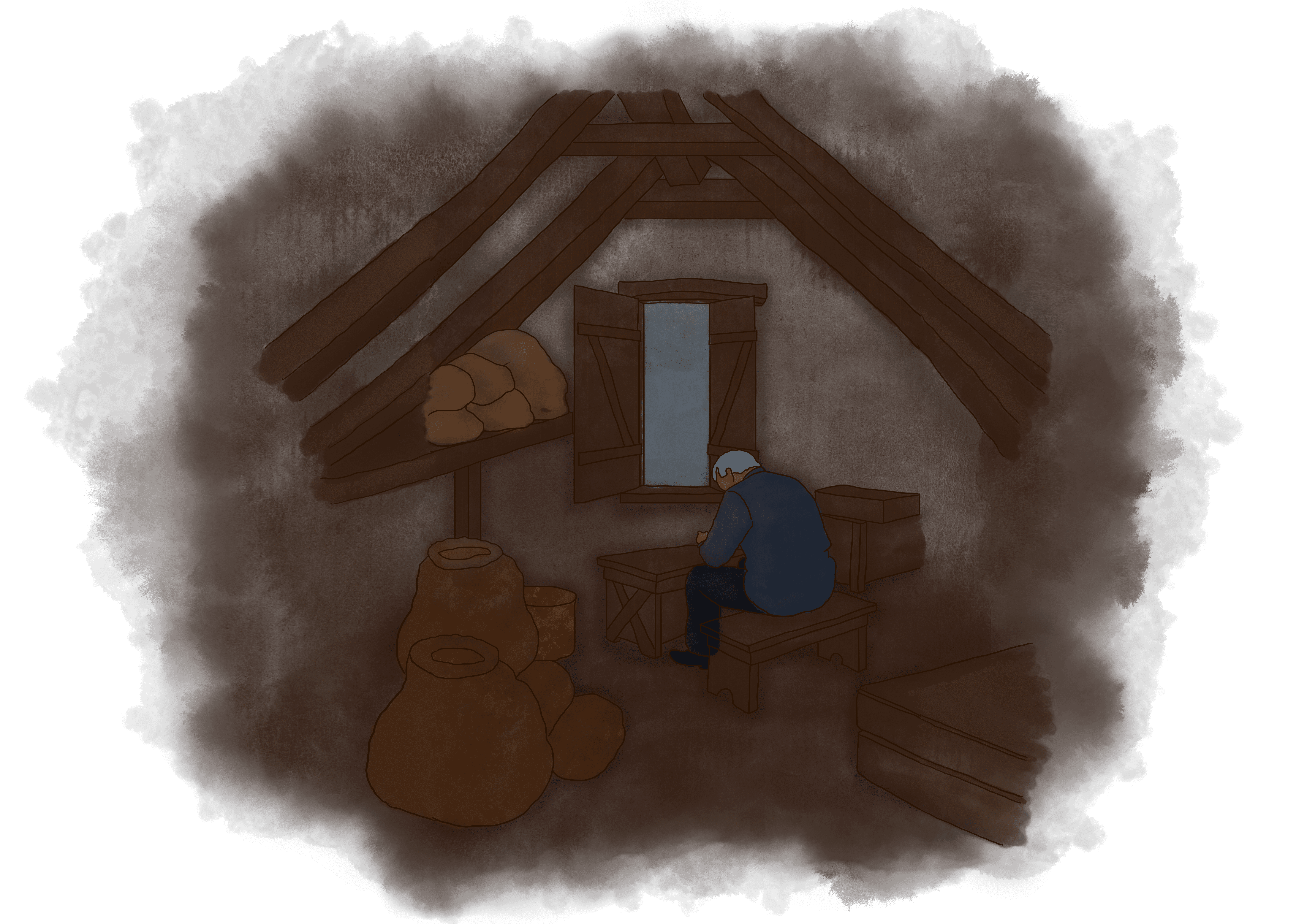
The style of illustration is water color illustration. Taking inspiration from the fluidity of the splashes, this style of illustration maintains that soft and romantic emotion even when the illustrations depict graphic scenes set in the French Revolution.
The scenes I chose to illustrate were important plot twists, character introductions, detrimental scenes, and other significant points in the story.



TYPOGRAPHY
DISPLAY FONTS
Book Title : Rafaella Shadow Bold
Chapter number : Bickham Script pro 3
Chapter Title : LTC Goudy Thirty
Dapifer Book
BODY FONTS
BOOK COVER
The book cover is inspired by the clothes, fashion, embroidery in Paris and London at that time. The aim was to bring in a human factor so that the story can be read beyond its content, it can be really felt through all the aspects.

BOOK BINDING
The original plan was to create a section bound book so that it has a flat lay design and enhances the reading experience. But, due to printing concerns like changes in paper quality, one unit printing, and costing I had to change the binding to a perfect binding. Even with a perfect binding book, I was able to achieve a flat lay output because of the weight and dimensions of the book.
PACKAGING
I decided to create a sleeve for the book packaging. A simple packaging would create contrast and the impact of the book and the graphics would be stronger. The sleeve has a cutout design inspired by the architecture from the places in the novel. The specific architecture style is French Gothic.
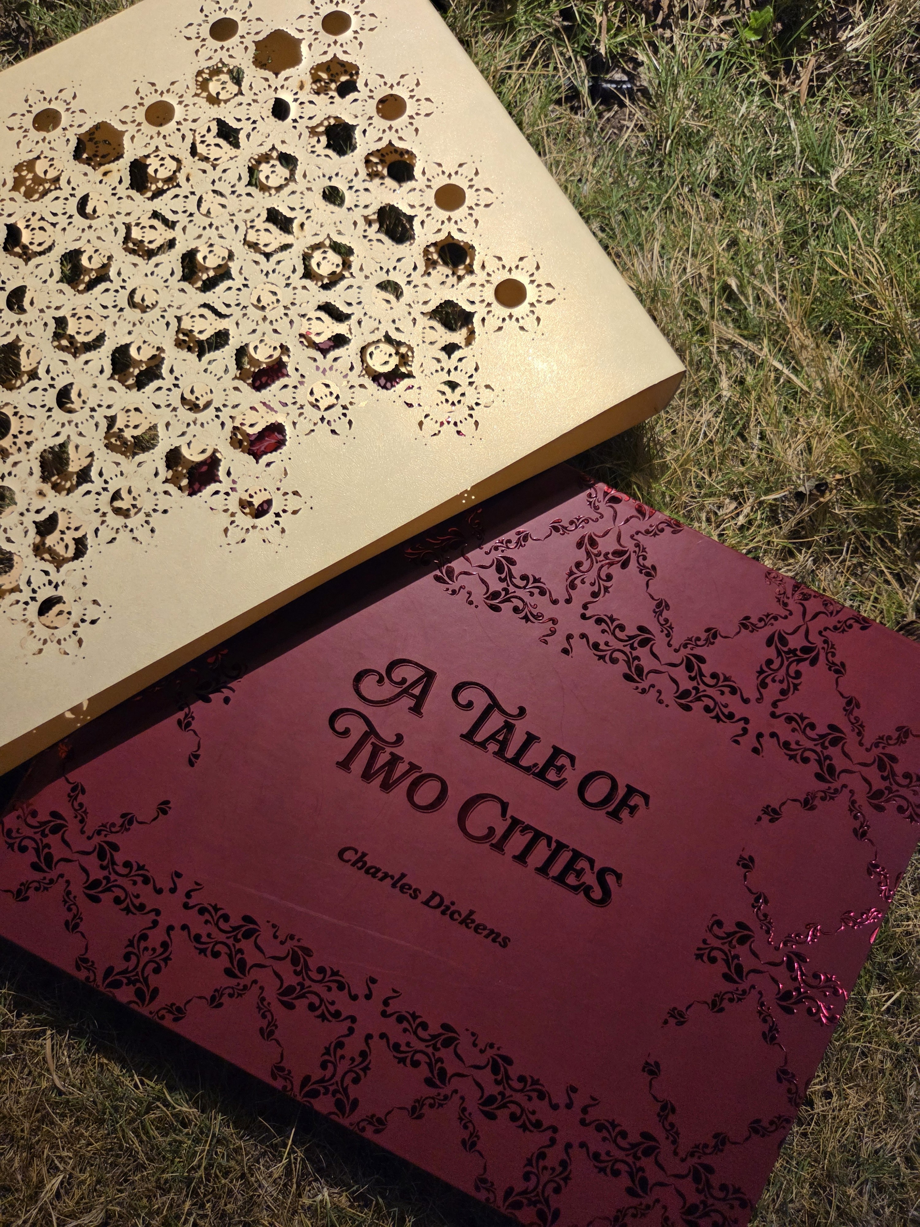
FINAL BOOK PRINT


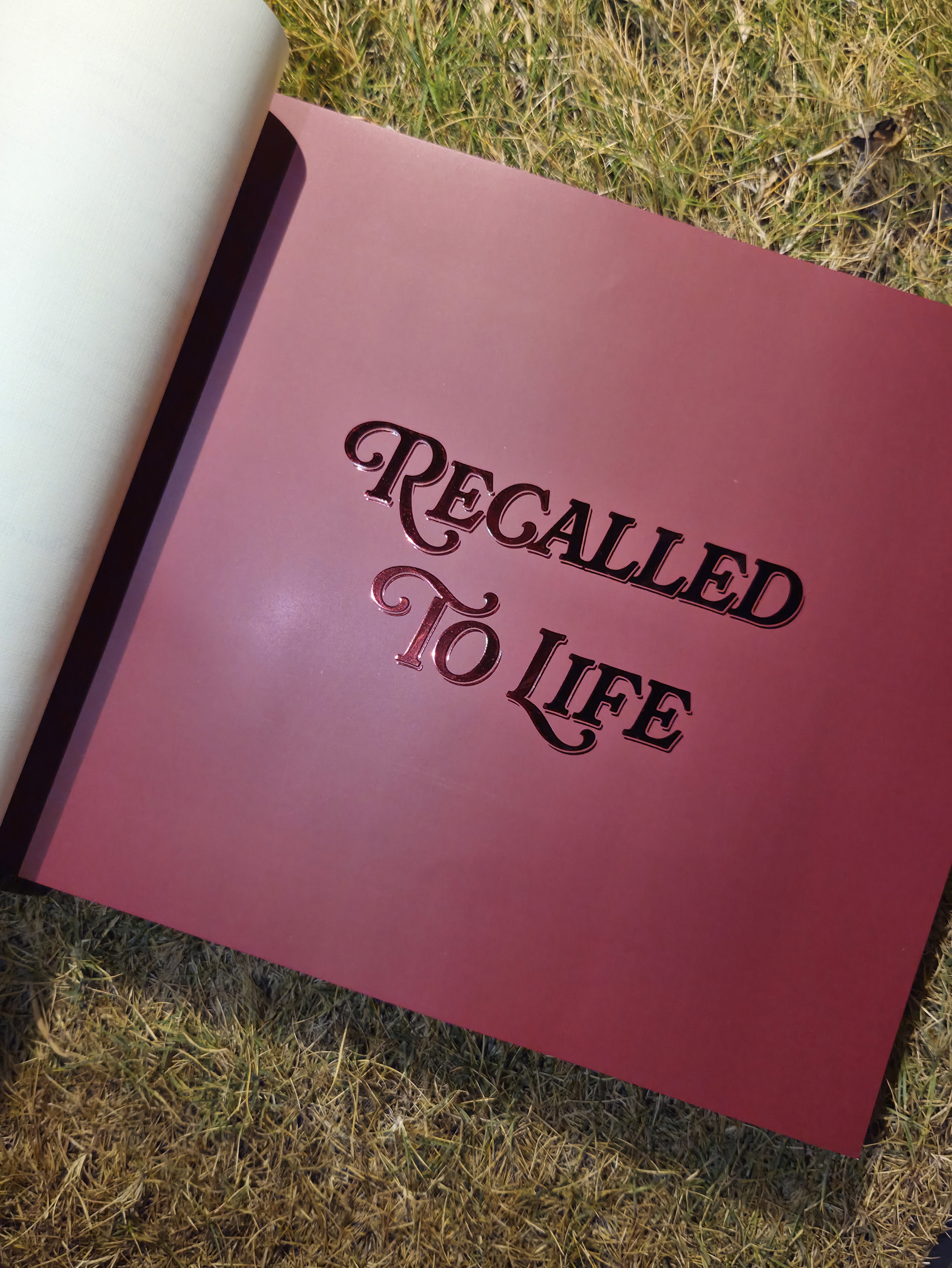
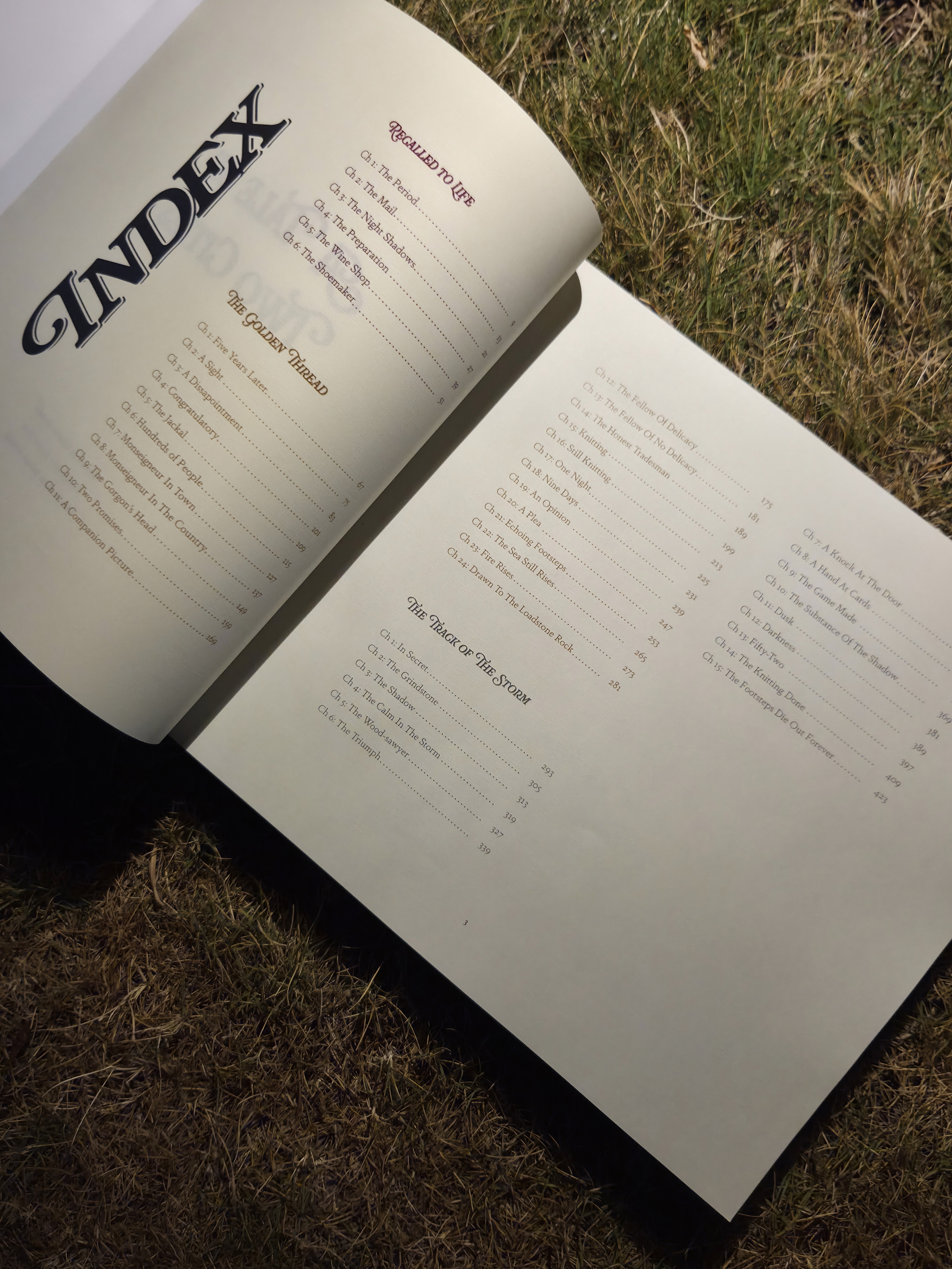
FLIP THROUGH THE BOOK TO READ

THANKYOU